Deep entertainment centers originally designed to accommodate large tube-type TV’s… desks in kitchens, which become clutter magnets… two-story high ceilings that echo and are expensive to heat and cool… hard to reach plant shelves that need dusting… depressing laundry/mud room entries from the garage… amenities such as these can make homes feel old and obsolete. The age of your home often reflects design features and amenities popular at that time. Generally speaking, the older the home, the farther away its design is from what today’s home buyers may be looking for.
The average age of owner-occupied homes in America is 37 years (American Community Survey from the National Association of Home Builders, NAHB). Particularly over the last four decades, professional home designers have catered to evolving home buyer preferences. This, in turn, has somewhat diminished the appeal and desirability of resale homes as prospective buyers factor in the added costs and hassles of remodeling along with the home’s purchase price.
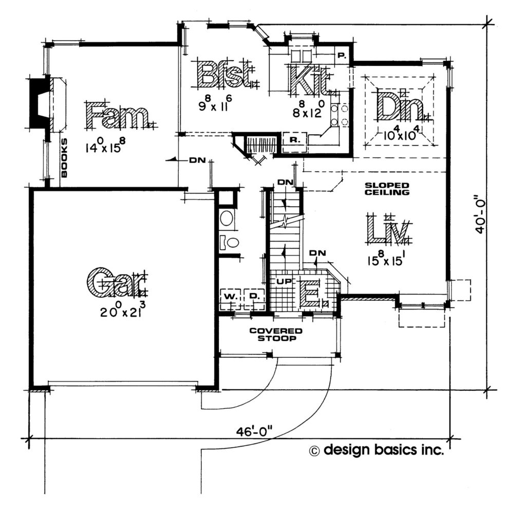
Design Basics’ Monroe home plan (now retired) was popular three-plus decades ago. It is two steps down from the entry into the formal living room, and there is also a step down into the “sunken” family room at the back. Unified great rooms for entertaining are more in vogue today, but not step-downs into living spaces. Similarly, the home’s formal dining room plus separate dinette has fallen out of favor compared to a single eating area, especially one that’s expandable for large get-togethers. The majority of buyers today prefer island kitchens to peninsula layouts, and the Monroe’s little pantry next to the dishwasher isn’t going to turn any heads. That kitchen is also closed off from the living and dining rooms, in contrast to the popularity of today’s open designs.
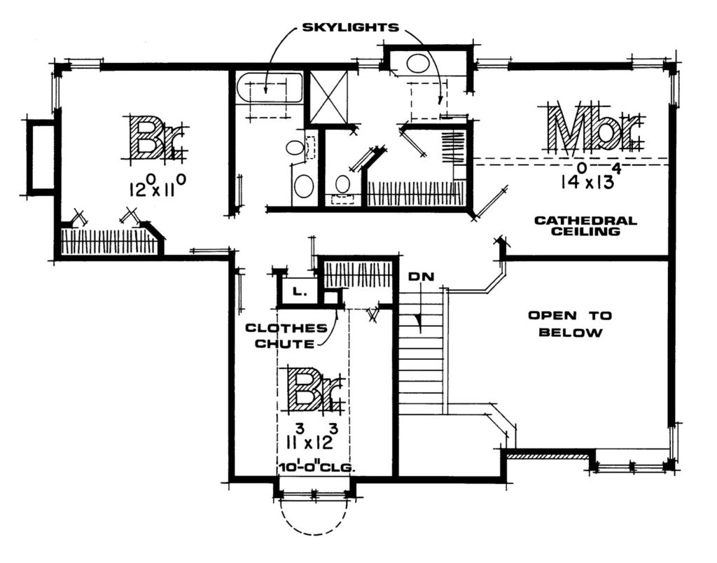
The vanity in the Monroe’s upstairs suite is wide enough to replace with the much more desirable double sink variety, but the skinny 24-inch wide doors leading into the bathroom, toilet area, and walk-in closet, as well as the hall bathroom, are considered drawbacks today. And it would be virtually impossible to finish living space in the Monroe’s basement with anything much taller than a seven-foot high ceiling.
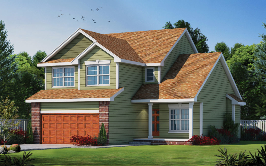
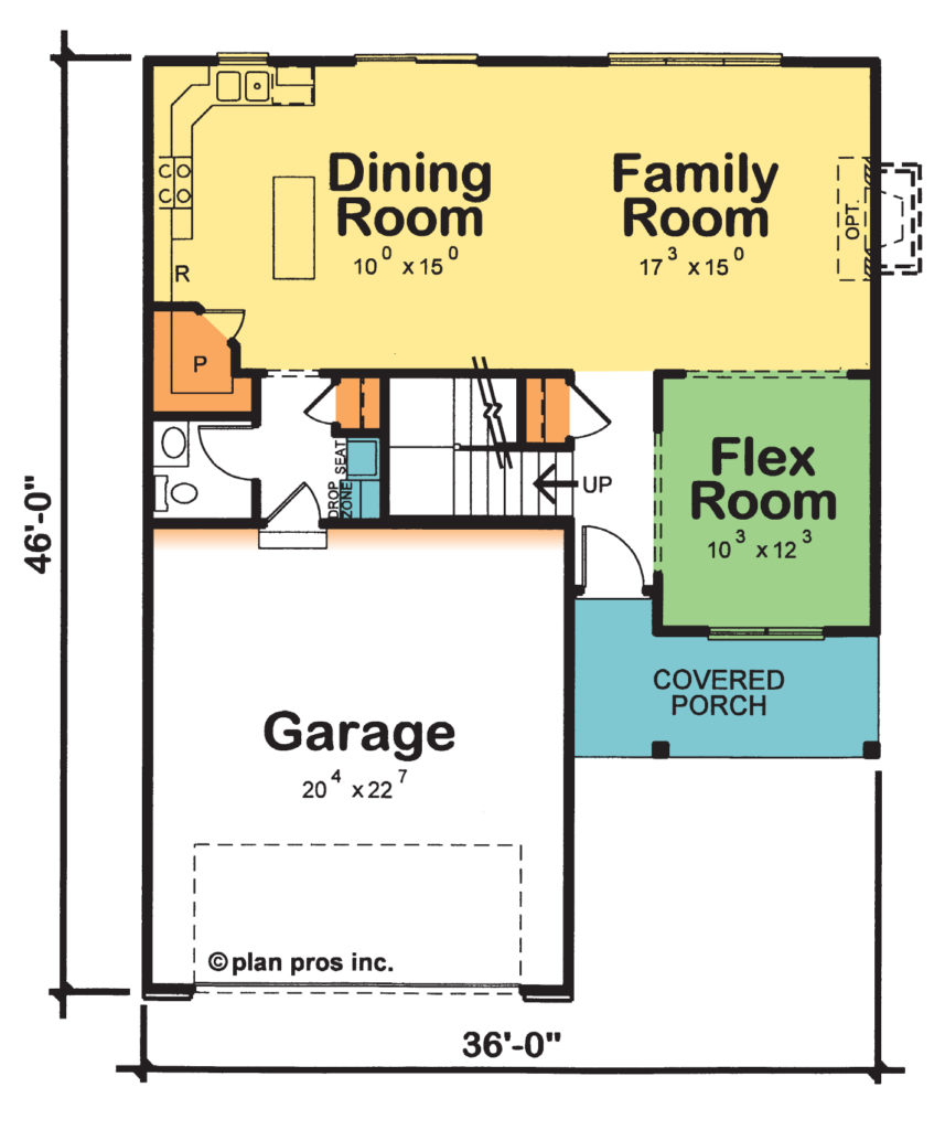
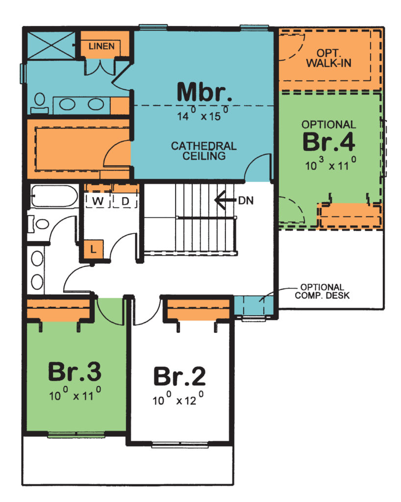
In contrast, the Herndon (plan 29318) has a flex room up front that could easily be closed off for a home office, and this design is wide open across the back. The island kitchen is served by a large walk-in pantry and coming in from the garage, a drop zone, seat, and coat closet rather than the laundry room. Upstairs, the hall bathroom is a compartmented layout with two sinks, alongside the conveniently located laundry room. Your bedroom suite offers great storage, two sinks in the bathroom, and a five-foot shower with the option of also having a soaking tub.
Though 35 square feet smaller and 10 feet narrower, the Herndon plan obviously was designed for today’s buyers.
Resale home prices loosely correlate with the home’s age, which makes sense as pricier, newer resale homes may have fewer design-related deficiencies. On the other side of the equation, new construction homes command a price premium – for example, they typically cost “more per square foot” than resale homes. Resale or new, purchasing a home is a large investment and price is important. It’s a number, and it represents a long-term commitment. But it is more than just a number, as it reflects your priorities, what you are willing to trade-off or settle for, and peace of mind – the topic of our next blog post.
For more resources on thoughtful design and products:
- View other articles on our blog
- Browse our Her Home™ Magazine
- Thoughtful Design Concepts
Cover plan featured: Herndon (plan 29318)
